The brief
The approach
Full-bleed editorial photography
Every section runs on the room's own light — no stock imagery, no cropped-to-fit compromises.
A drag-to-explore signature-dishes carousel
Browsing the tasting menu feels like turning a page, not scrolling a list.
A tabbed carte — Entrées / Plats / Desserts / La Cave
The full menu structure stays on one screen instead of forcing a scroll through four courses.
Selected views
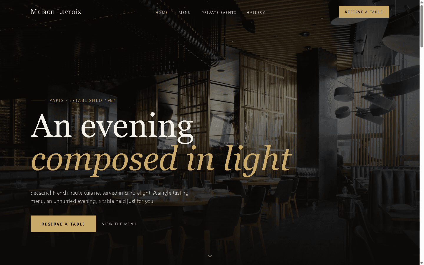
Full-bleed photography and a restrained gold accent carry the room's own atmosphere into the browser.
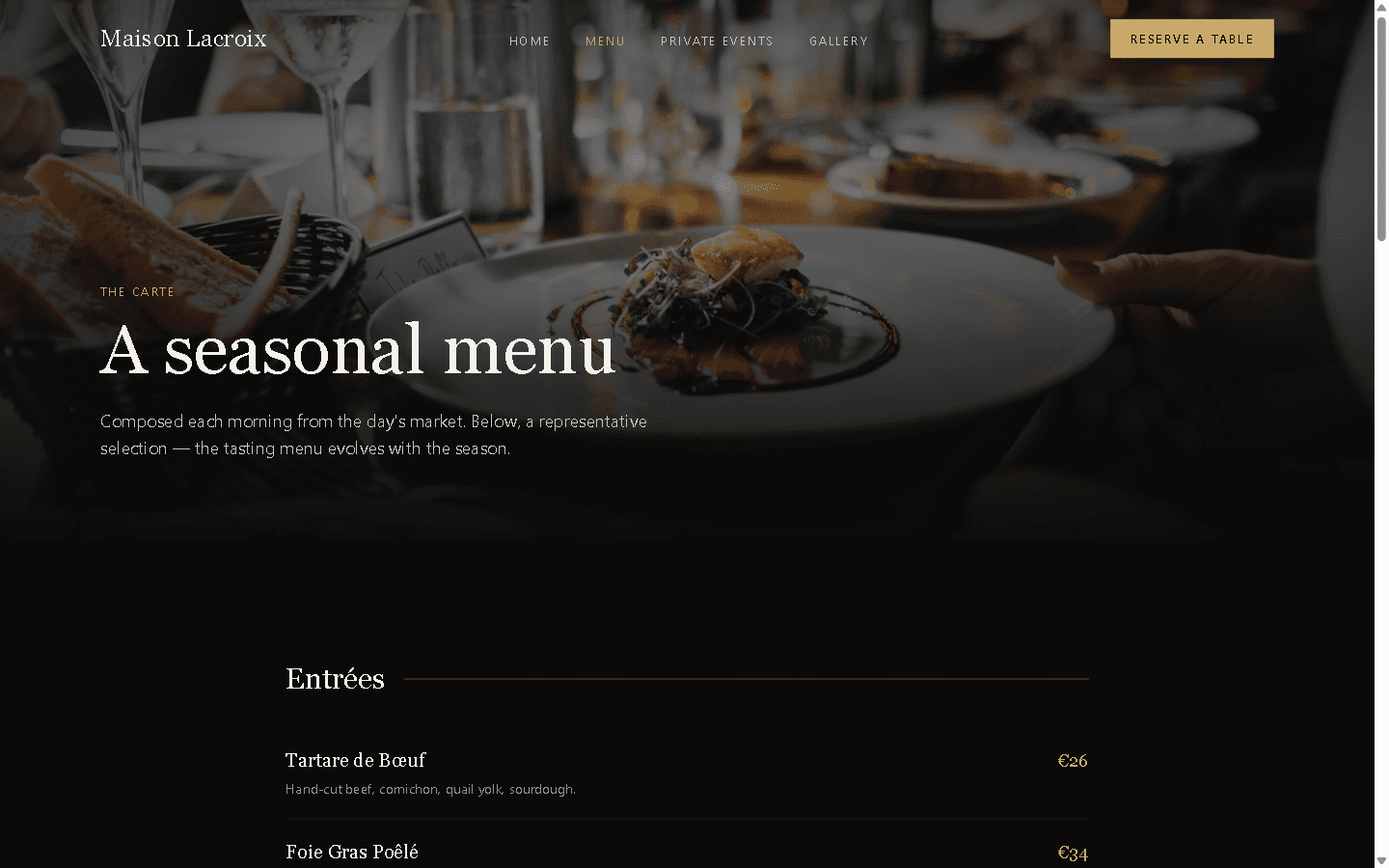
Entrées / Plats / Desserts / La Cave — the tasting menu's own structure, kept to one tabbed screen.
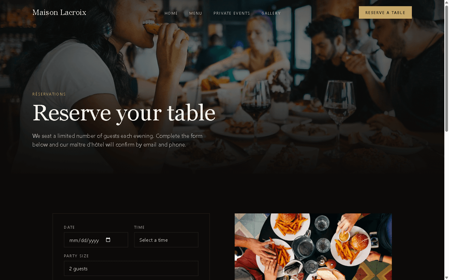
Reservations sit apart from the editorial pages, so booking never competes with the mood.
What it demonstrates
Interfaces
The room's atmosphere translated into interaction — full-bleed photography, a drag carousel, and a reservation flow that never interrupts it.
Begin an inquiry